Most cannabis brands start with a logo. BOBA started with a name. A name that sticks the second you hear it — playful, sweet, instantly memorable in a market full of forgettable strain names and serious-sounding "genetics" labels.
From that name, PLANT built the whole thing: the bubble-letter logo, the three-colorway bag system, the product photography, and the drop menu. A brand a budtender says out loud and a customer asks for again.
BOBA. One word, four letters, impossible to forget. It borrows the warmth of something everybody already loves — and lands in a category where most products are named like lab samples. The name was the strategy. The logo made it a brand.
The bubble-letter mark is the name made visible — soft, rounded, candy-shop energy with a confident heavy weight. It carries across every colorway and every format without losing itself. Designed to look as good shrunk onto a bag as it does blown up on a menu.
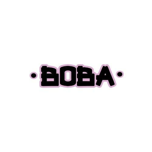
A custom bubble-letter wordmark, built from the BOBA name up. Rounded, bold, and instantly readable — the kind of logo a customer can picture before they reach the shelf.
Engineered to flex: one mark, recolored cleanly across the full bag colorway system without redrawing a thing.
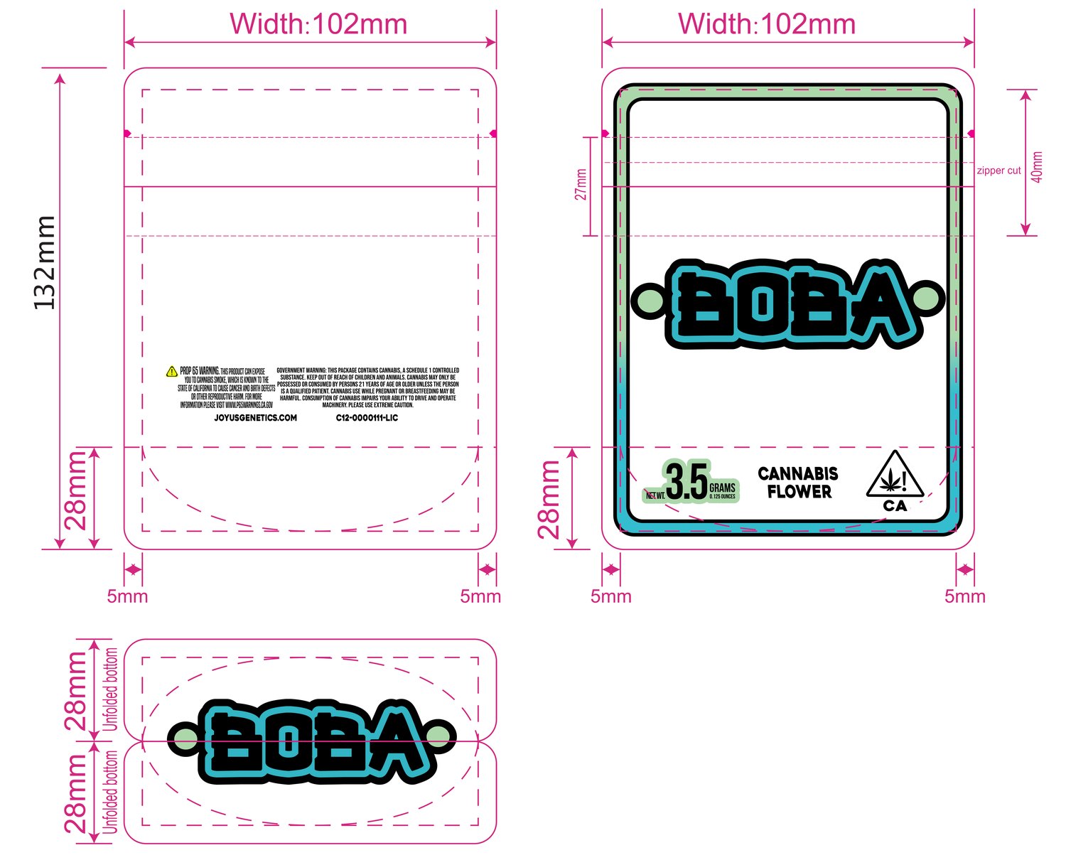
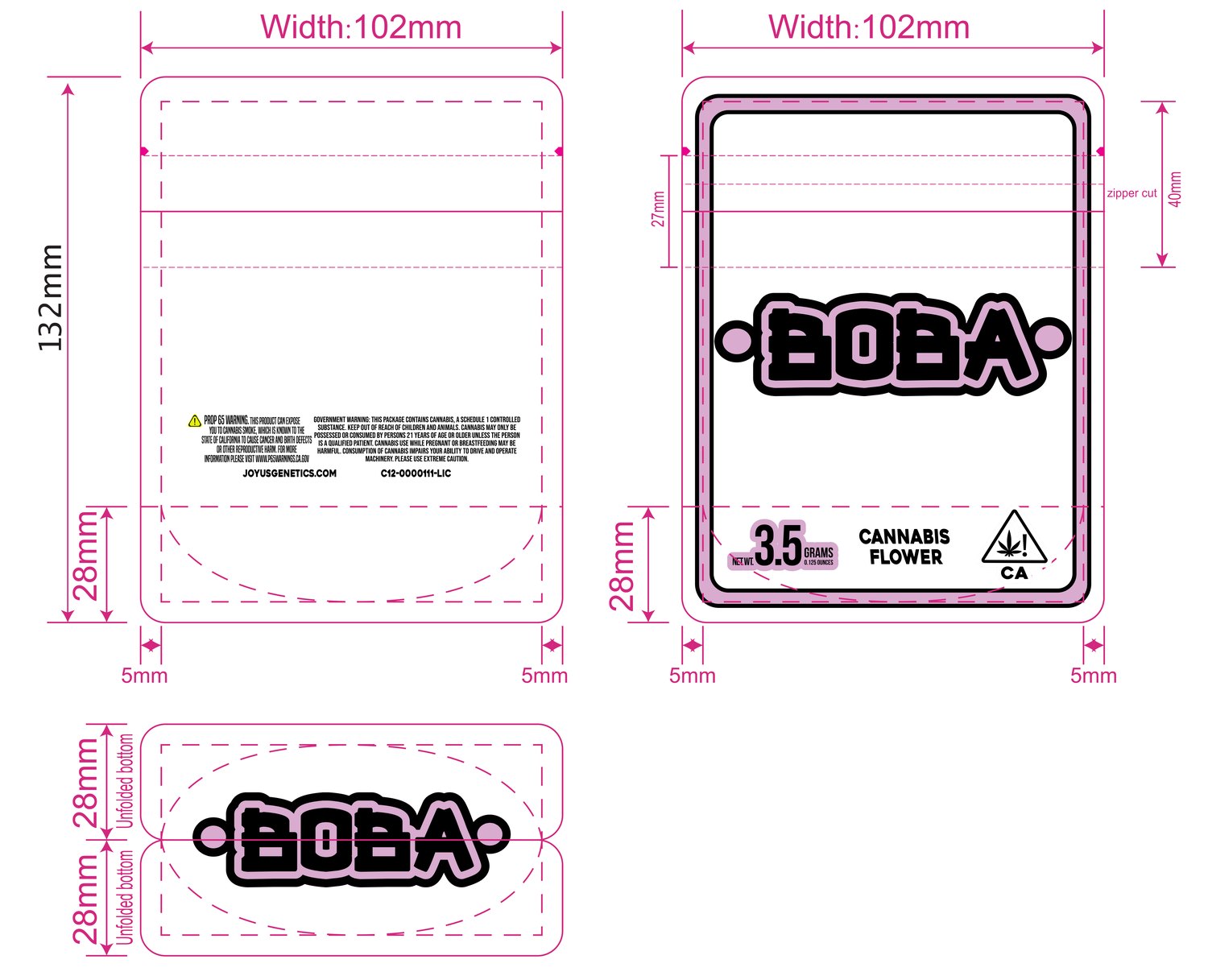
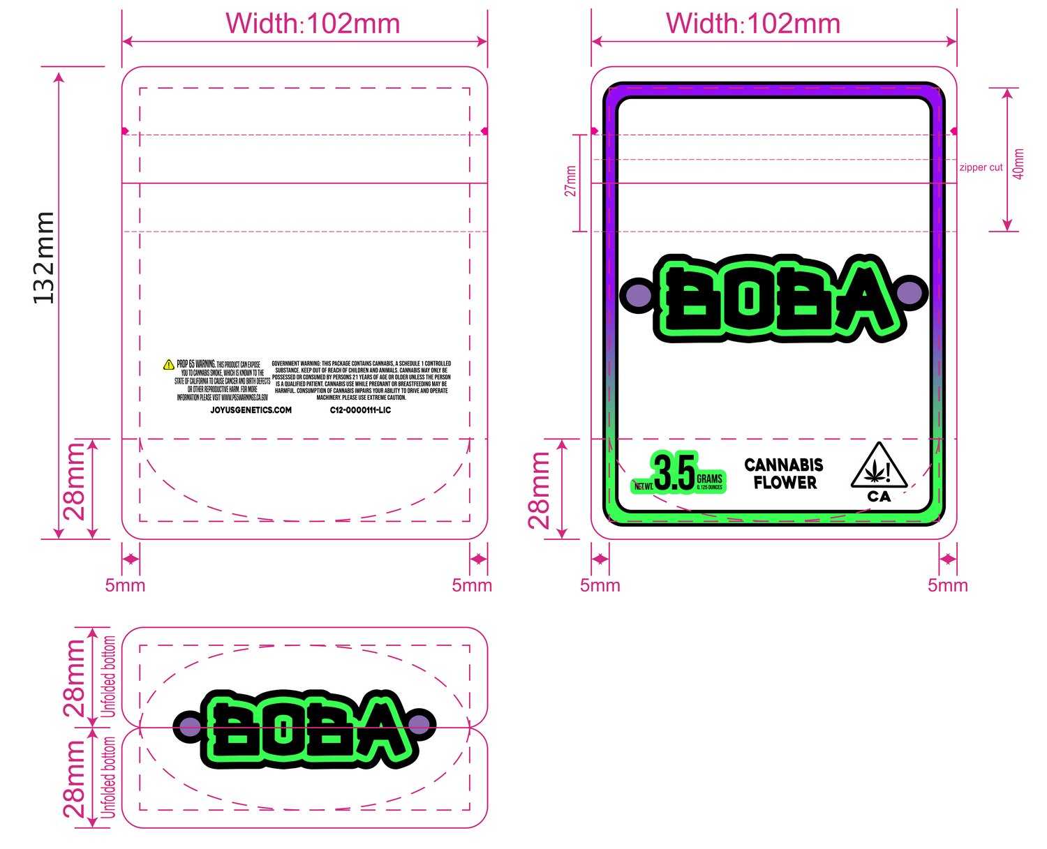
The BOBA mylar bag — designed as a real production dieline, then built out as a three-colorway system. Blue, pink, and purple-green: one structure, one logo, three looks that let the brand run a whole drop without ever feeling repetitive.
Every bag drawn to print spec — 102mm × 132mm, zipper cut, fold lines, safe area. Full California compliance built in: government warning, license number, net weight, universal symbol — placed clean so the legal copy never fights the logo. Production-ready files, not mockups.
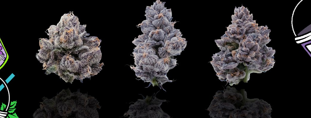
Product photography shot in-house — flower on pure black, lit so the trichomes and color read hard. The shots that anchor the menu and give the brand a consistent, premium visual base across every drop.
Black field, hard light, no props — the same discipline that makes a small independent brand photograph like a major one. Great flower only sells if the photo does it justice.
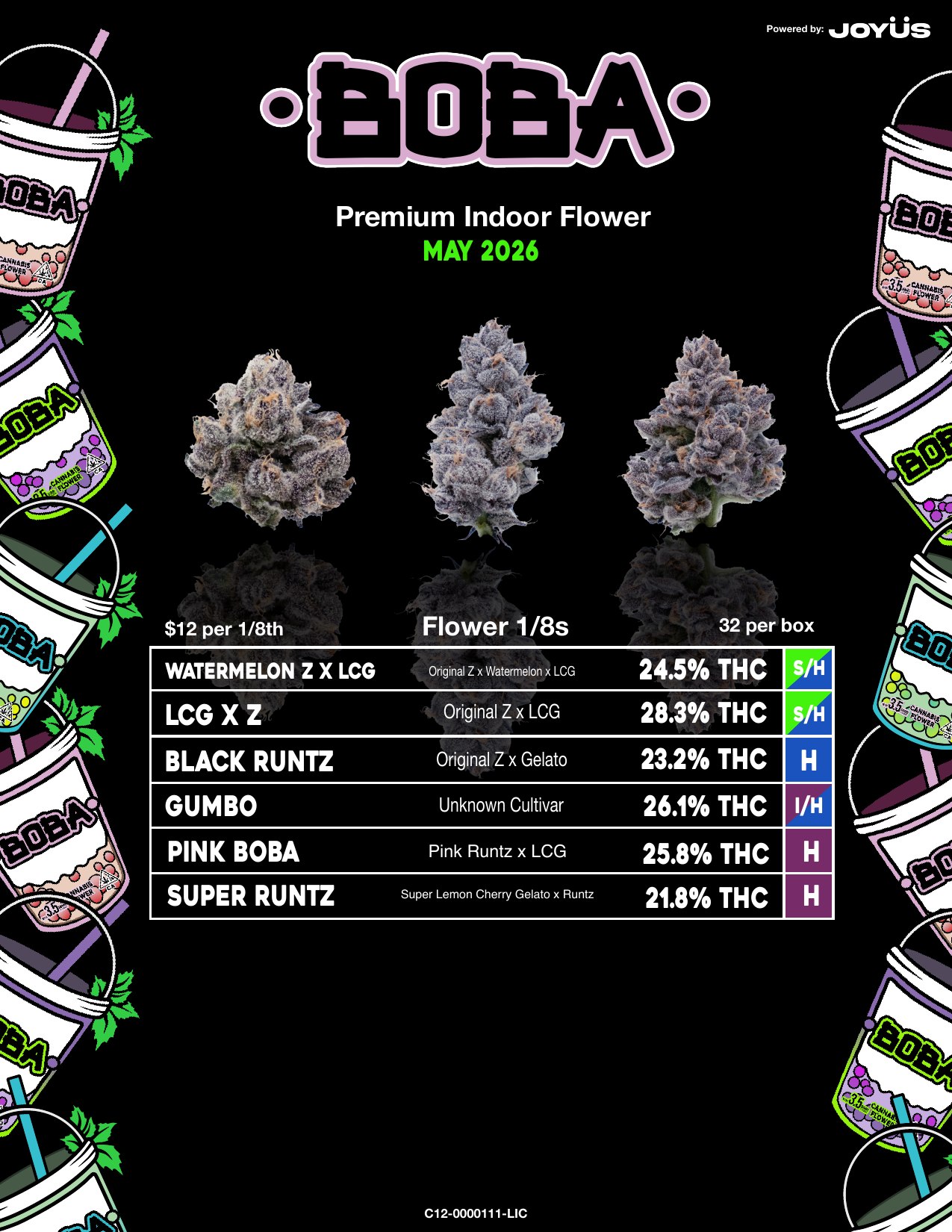
The BOBA sales menu — the page a buyer scans to place an order. Strain, lineage, potency, and type legible in one pass, wrapped in the brand's boba-cup pattern so the document sells as hard as the spreadsheet behind it.
The full designed menu — boba-cup pattern, strain table, photography, and compliance — built as one cohesive piece a sales rep is glad to hand over.
BOBA is a brand built in the right order — name first, then the logo to carry it, then the packaging and photography and menu that take it to a store. Every piece points back to one memorable idea.
A name a customer remembers, a logo a budtender recognizes, a bag that runs a whole drop, and a menu that closes the order. That's a brand system — built from the name up.