Flora & Flame grows no-till indoor living-soil flower in West Oakland — boutique, top-shelf, the opposite of mass-produced commercial cannabis. Great flower. But the brand around it had just been taken in the wrong direction.
An outside agency had rebuilt the brand for a six-figure fee — and gotten it wrong for the culture. PLANT made the call to reverse it, then built the real system around it: jar packaging, product photography, the drop menu, and the sales material that actually moves product into stores.
Before PLANT came in, the brand had been handed to an outside agency and rebuilt for a six-figure fee. The new direction was clean, corporate — and wrong. It read like a pharmacy, not a West Oakland flower brand. The culture would have rejected it on sight.
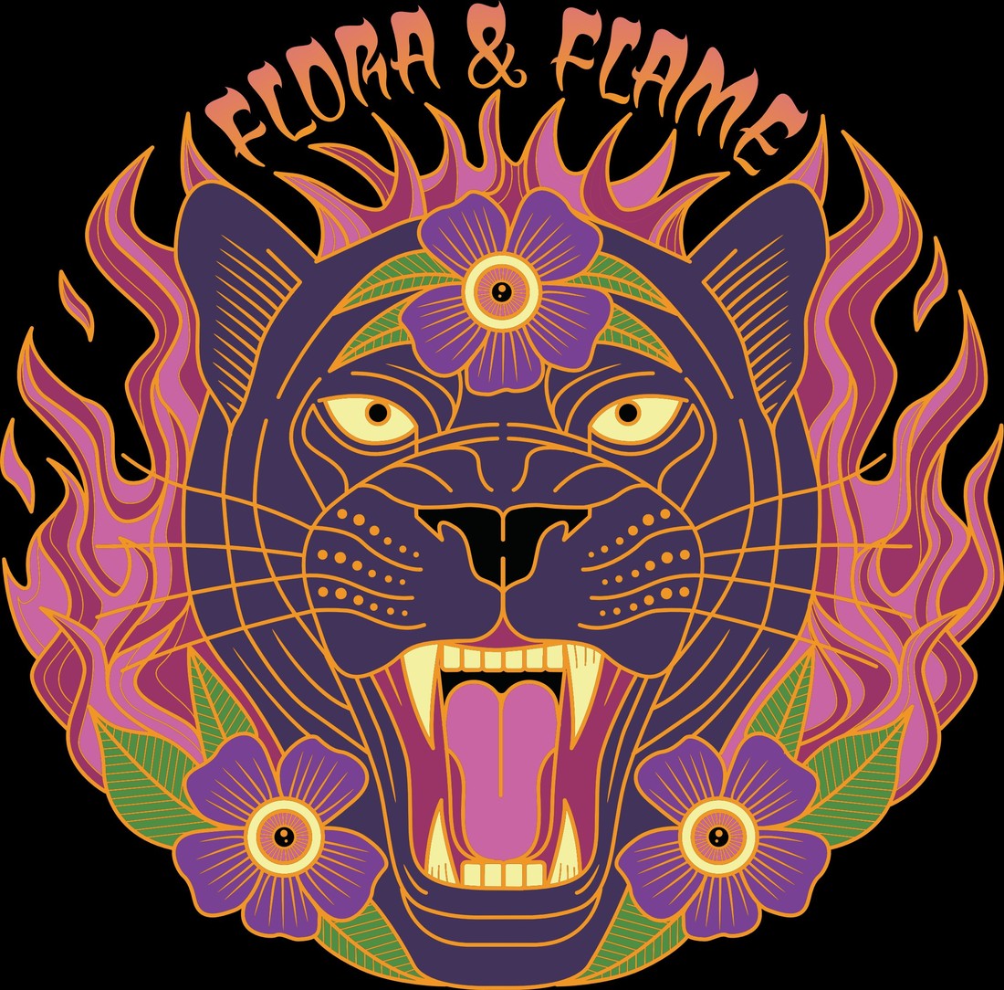
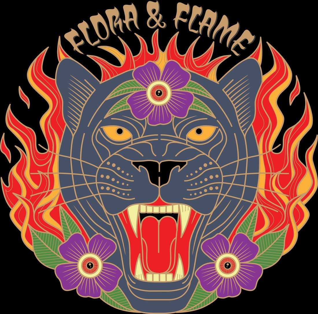
The original mark — the flame-wreathed panther — already had equity. The people who buy this flower already knew it and trusted it. The expensive rebrand was about to throw that away right before market launch. The first real decision wasn't a design. It was the call to stop one.
PLANT's recommendation to the owner: finish the current packaging run, shelve the agency rebrand, and go back to the brand the culture had already voted for. Protecting the right brand is worth more than designing a new one. Below — the panther mark that stayed, carried across drop colorways.
With the right brand protected, the work was building the jar around it. PLANT designed the label artwork and ran the packaging direction — the wrap, the layout, the finish, and the sourcing that put it on shelf at the right cost.
The decisions that mattered: a flat black jar for a premium, high-end hand-feel — the kind of thing a customer flexes on their own Instagram. A custom clear bottom, because buyers want to see the flower before they trust it. Every finish chosen so the jar feels like the top-shelf product inside it.
Then the part nobody sees on the shelf: sourcing. Six years and 60+ vendor relationships meant PLANT could spec a fully custom jar — and still cut packaging materials cost by more than 50% versus what the brand was quoted. Premium feel, half the cost. That's an operator's decision, not a designer's.
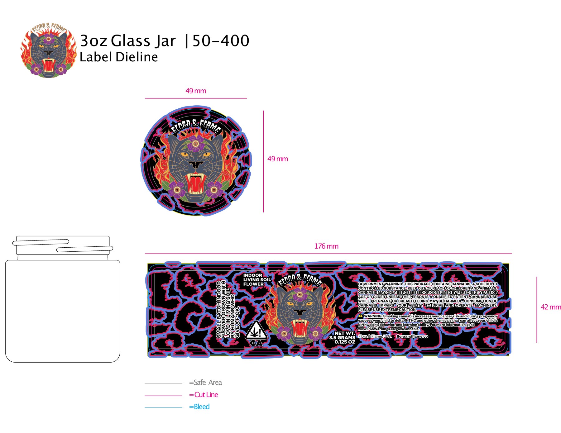
Label artwork built around the mark, drawn as a real dieline — cut line, bleed, and safe area for the exact 3oz / 50-400 jar. A file a printer runs with no back-and-forth.
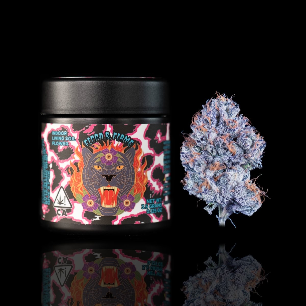
A fully custom jar — flat black, clear bottom — sourced through a vetted vendor network at less than half the materials cost the brand had been quoted.
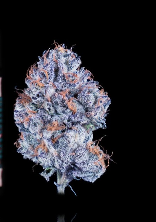
Product photography shot in-house — jar and flower on pure black, lit so the trichomes read and the label artwork pops. The shots that run on the menu, the socials, and every sell sheet.
One consistent look across the whole drop: black field, hard light, no props. It makes a small independent brand photograph like a major one — and gives every other piece of material a clean, repeatable visual base.
The Drop 8 sales menu — the document a buyer scans to place an order. Designed for speed: strain, potency, type, and price legible in one pass, with full strain detail pages behind it.
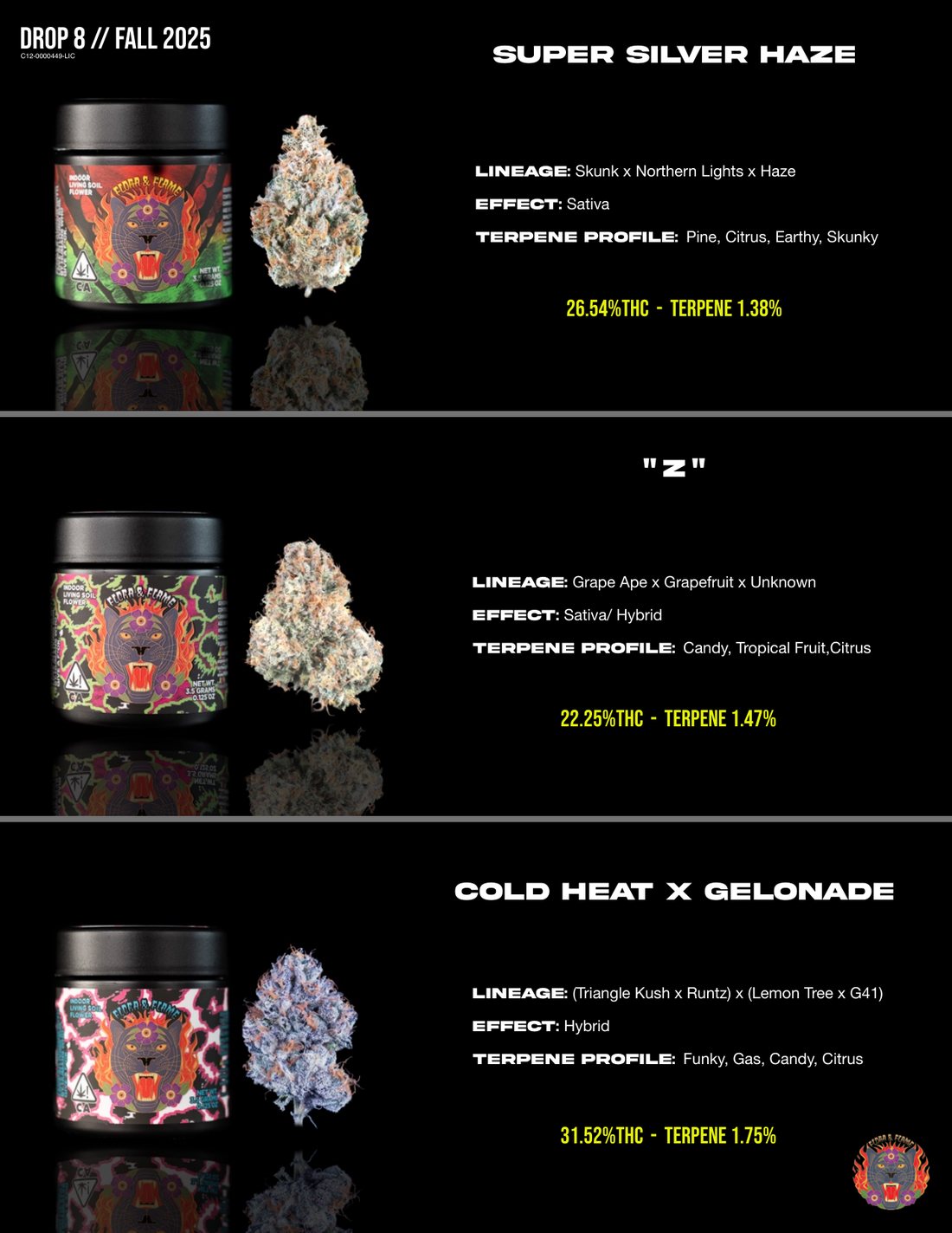
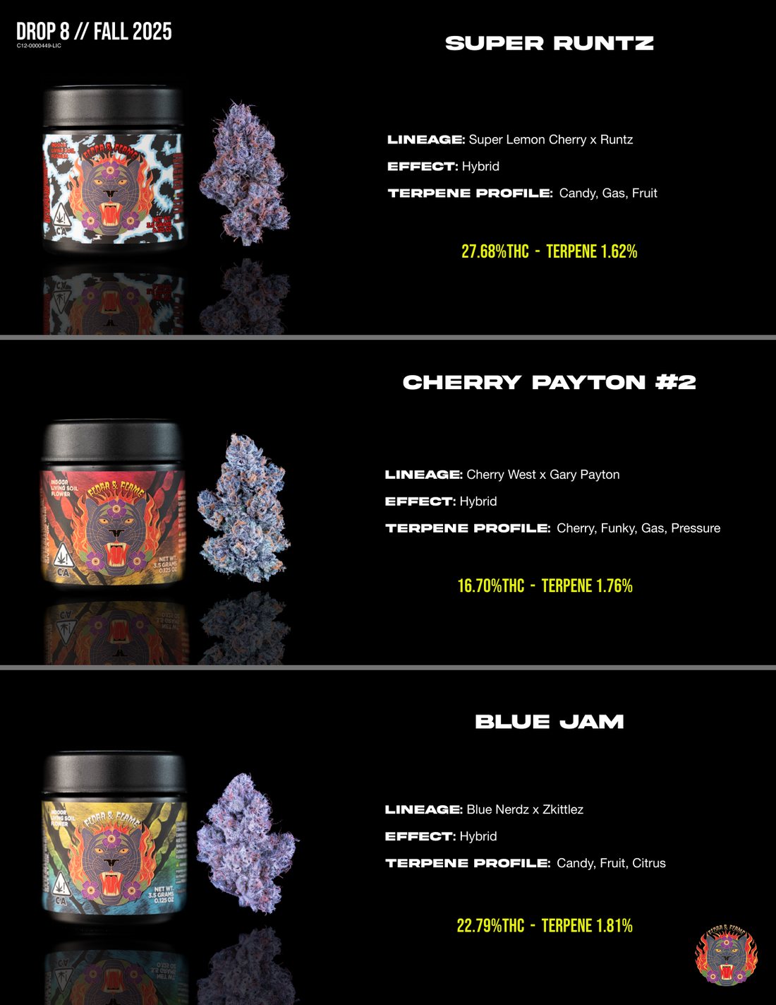
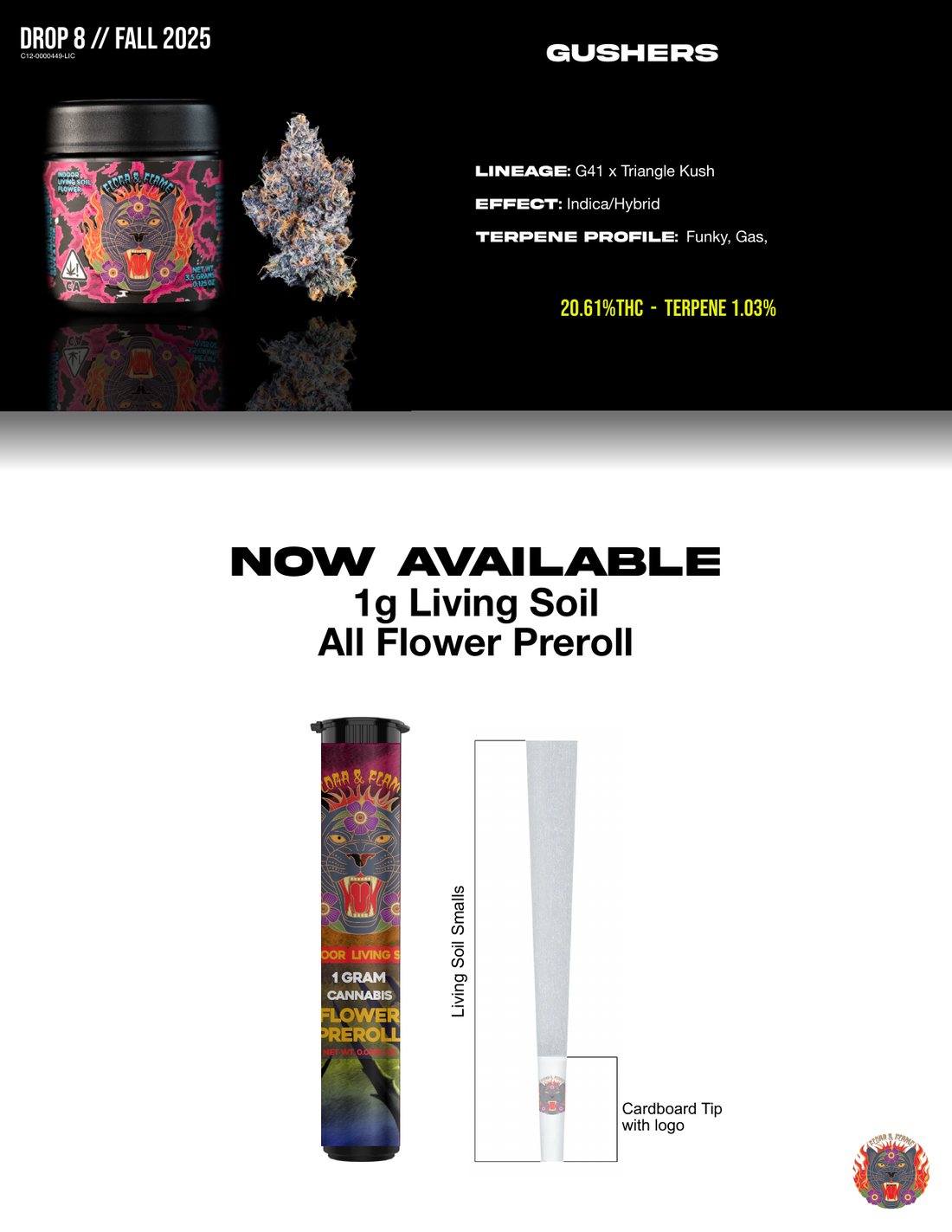
Behind the order page, a full strain library — lineage, effect, terpene profile, and photography for every cut in the drop. The pages a buyer reads when they want to know exactly what they're putting on the shelf.
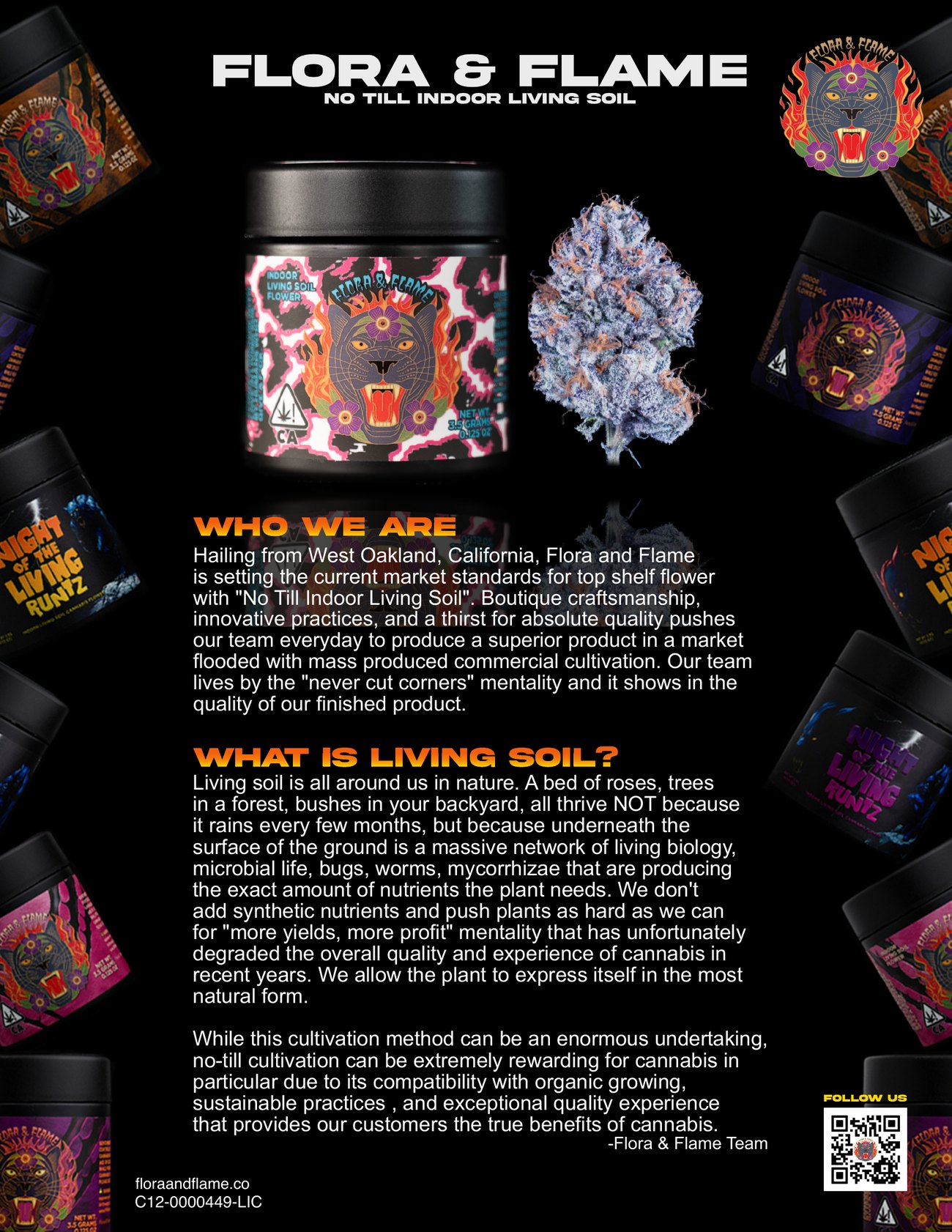
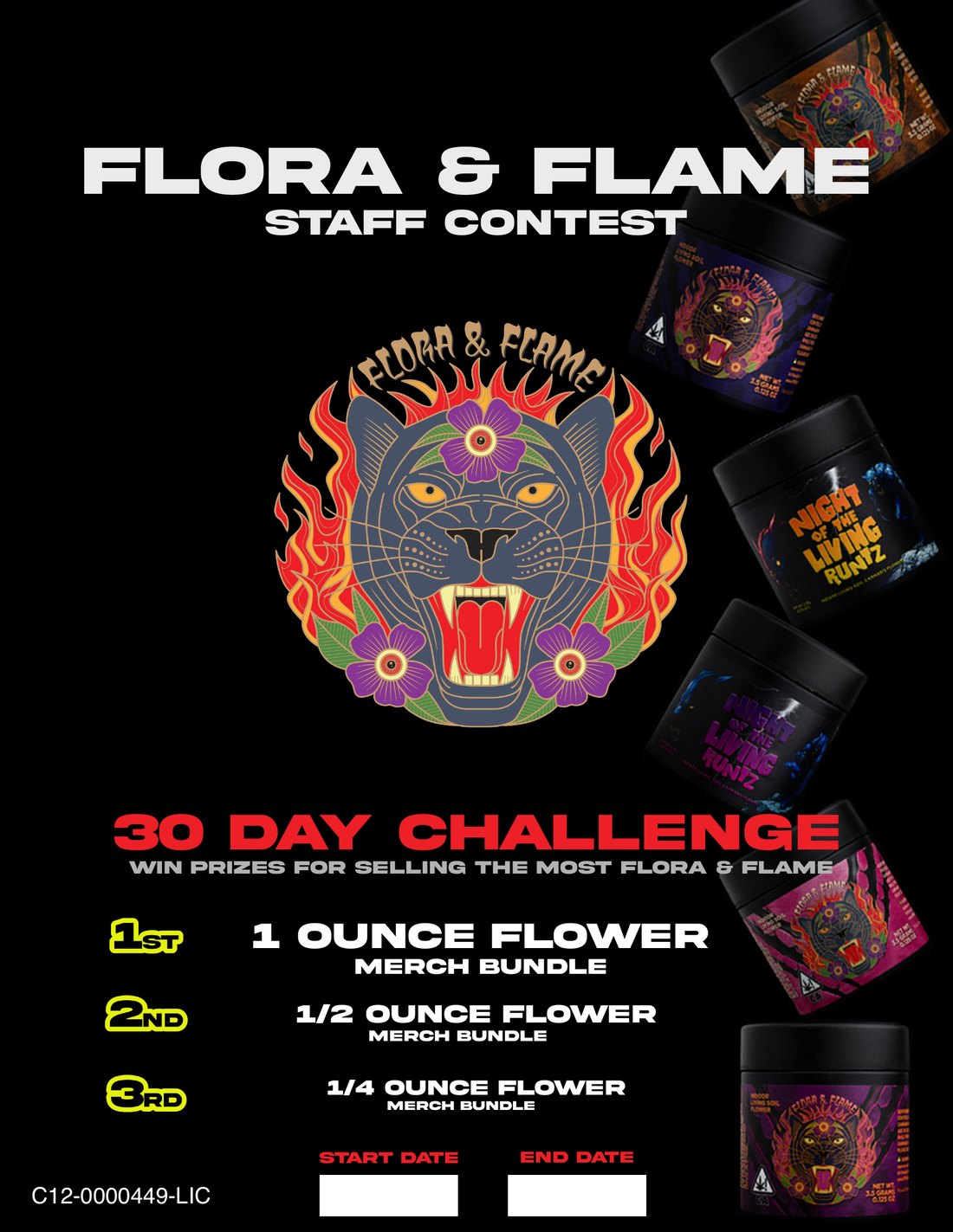
A brand is only as good as what the sales rep walks in with. Flora & Flame got a full kit — the one-sheet that opens a buyer conversation, the retail announcement that drives traffic, and a staff incentive that turns budtenders into the brand's sales floor.
A brand protected from a bad call, jar packaging designed and sourced, photography, menu, sell sheet, retail launch, staff incentive — the full path from "this isn't working" to a product a store actually reorders. That's the difference between a designer and an operator who builds brands.